Ever since I have bought that stack of red fabric at the craft fair... I have been dying to start on it!
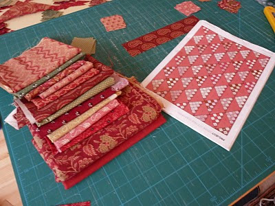
The fabrics are a mixture but mainly by Judie Rothermel. The collection is inspired by The Old Sturbridge Village Collection (for Marcus Brothers) so I read on the selvedge, and they look very beautiful and richly coloured.
The pattern (lying next to the fabrics) is from the Popular Patchwork September 09 and called Stone Cottage Comforter.
My excuses for the poor photo quality.. a dreary day here with rain and it didn't make for very good photos...
I have cut out most of the squares and triangles, but am finding (yet again... this is rail fence revisited!) that I do not like the darkest green in there...
What do you think ??

There are 3 greens in the quilt. The dark olive, the light olive and the very dark christmas tree like one with fleur the lis on. I think I will have to take that one out....
As you can see I have started assembling the colours together and sewn up some of the triangles, about a quarter on the way on the pieced triangles now....
There is a LOT of matching up seams... So THANK YOU again to DANA for teaching me how to do that in her tutorial on her Old Red Barn Co site. I had some practice on the Irish quilt and that really is standing me in good stead now as the pieces are much much smaller...
















5 comments:
I like the dark green - I think you need the contrast - but it is hard to really tell from the photo so you need to be the judge! Good luck with all the pointy triangular seam matching - I'm really not very good at that...
Glad to see you are SO busy at the moment!
I like the dark green, too, but if you don't like it, then get rid of it! I would be more concerned about it looking "Christmasy" with the reds and greens, but I really don't think there's enough green involved to do that.
Great quilt pattern, though, Marguerite. Can't you ever do anything EASY? lol You are giving me a complex!
gee this one looks hard to do ... I would love it for Christmas or anytime.
I like the greens with the red too - what if you put the triangles with the greens more to the sides of the quilt - this would carry your eye back and forth across the quilt but the greens would not jump from the middle as they do now. Just a thought - its always fun to move the fabric around in the placement.
It's always a little hard to tell from a photo. Perhaps the tone of that green is bothering you. From the photo though, I think it looks fine. I like the spots of contrast which help give an old time quilt appeal. In any case, this is clearly going to be another beautiful quilt -- I love the pattern and the fabrics you've chosen.
Oh Marg....I'm with the others...I like the green...all of them. I don't think it sticks out at all!! You need to have that contrast to make movement across the quilt.
No tearing out!!!:) It will be beautious!:)
Happy New Year!!
xo
Post a Comment